Urban Institute
SITE DESIGN
Project overview
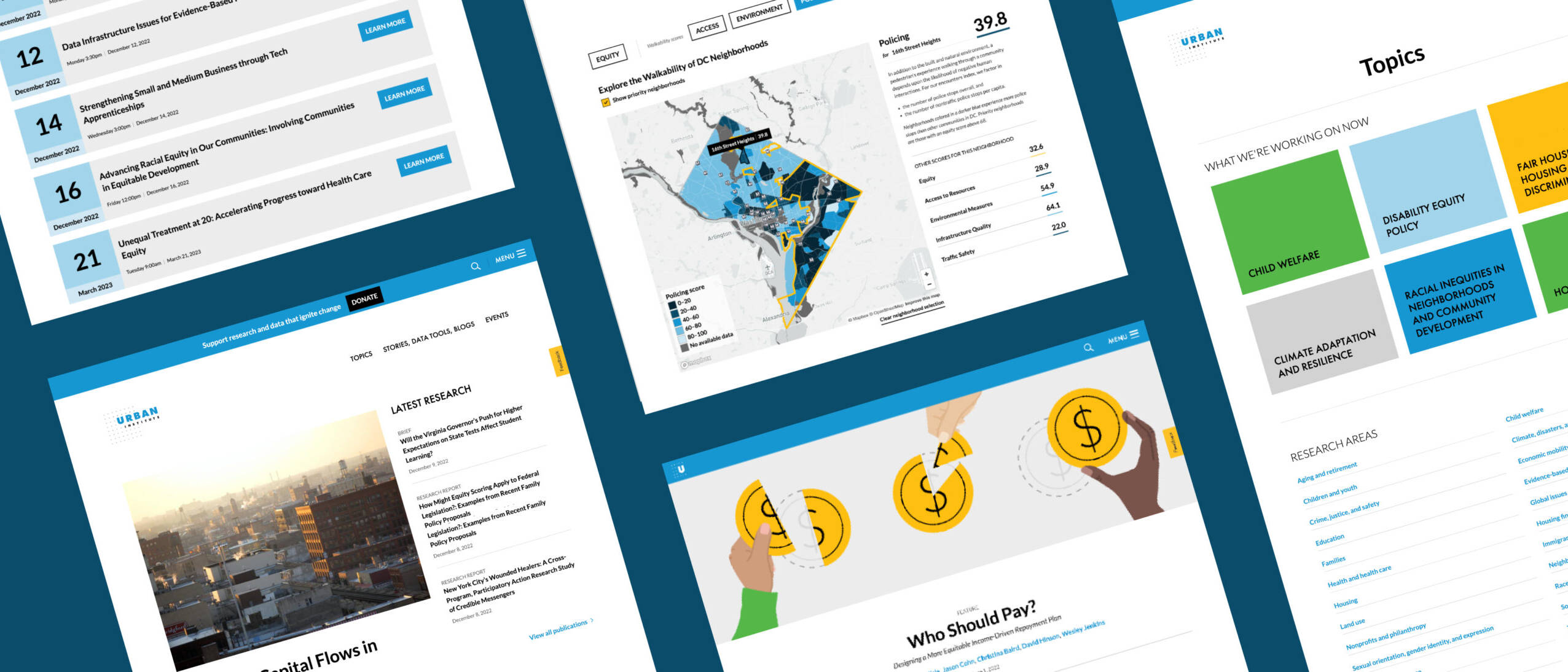
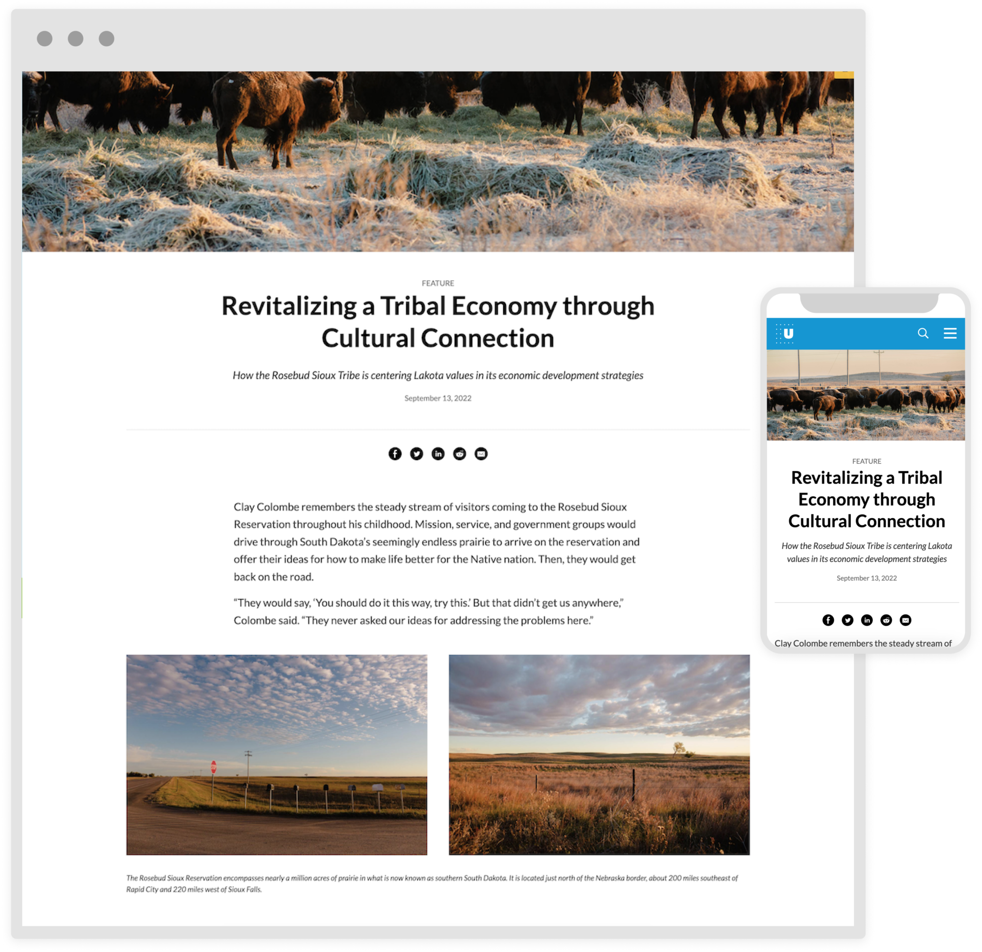
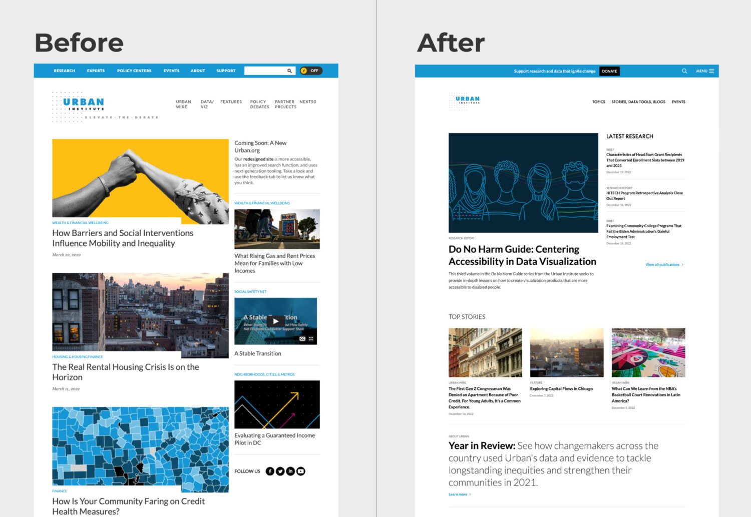
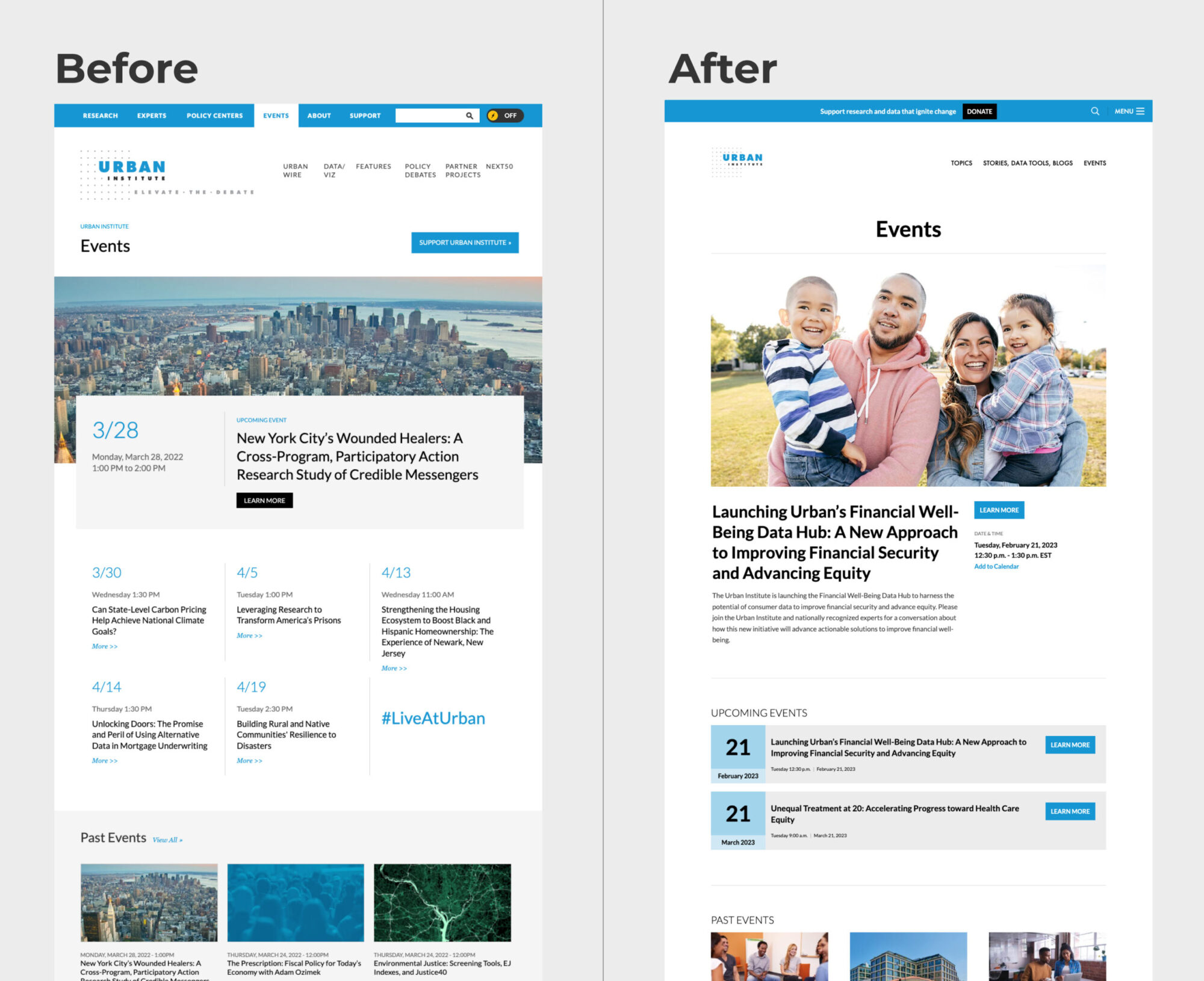
Our scrappy team worked on a site redesign for Urban.org over the course of several years. My focus was to improve the usability, and flexibility of the site. We accomplished this by adopting a modular design of components and adhering to the WCAG AA accessibility standards. Additionally, we improved readability by increasing font sizes, reducing line lengths, and ensuring that the site was inclusive of both large and small screens. We launched the redesign in spring of 2022, resulting in a more user-friendly and accessible Urban.org.
Flexibility
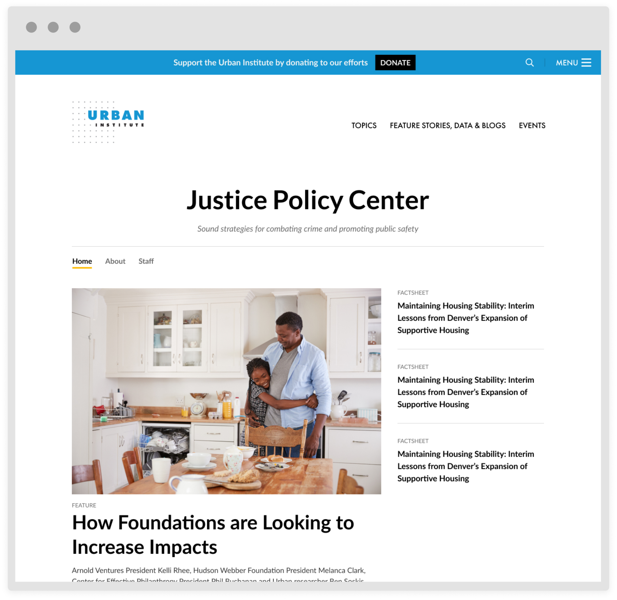
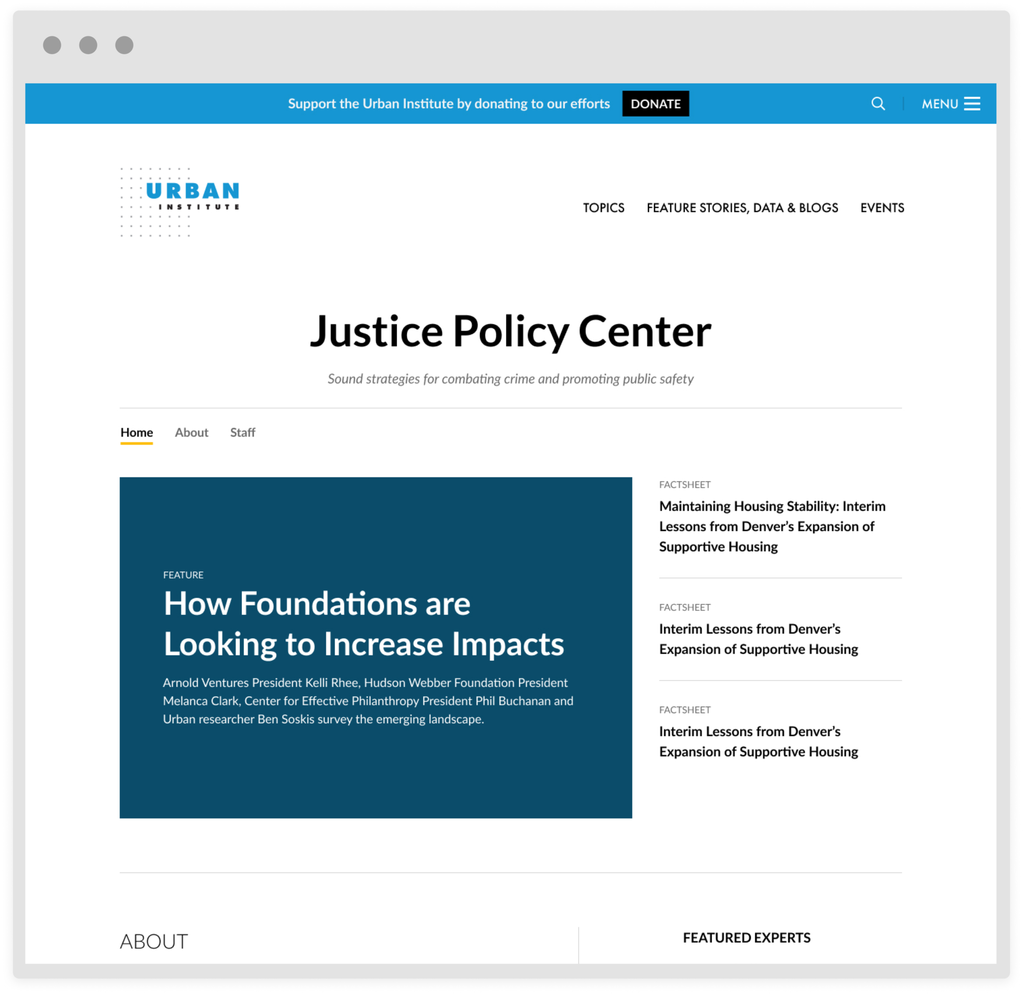
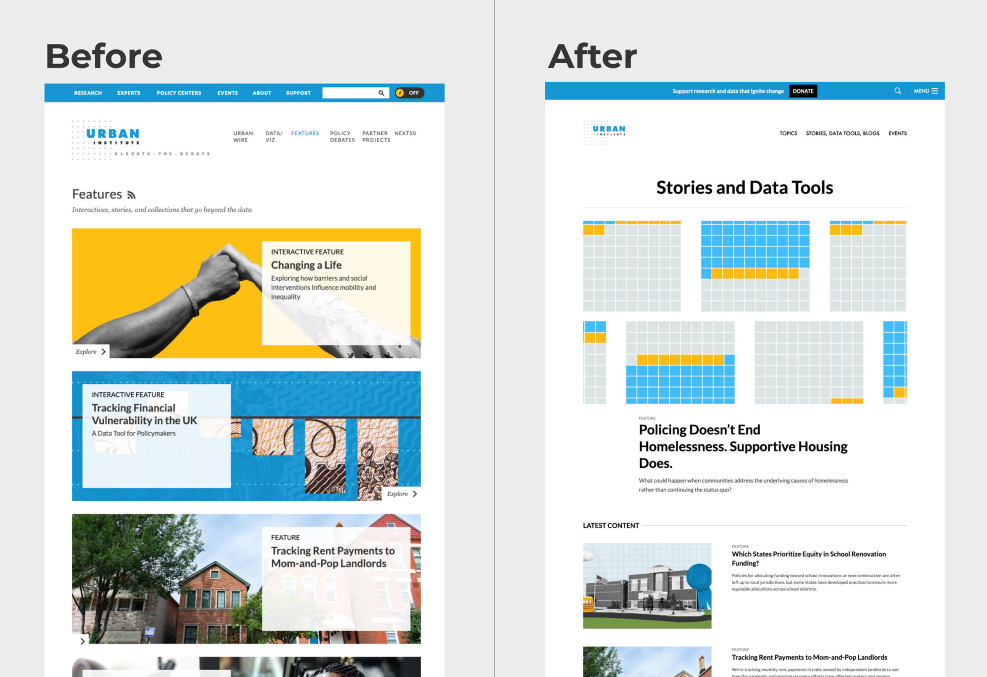
Flexibility was a key theme of our redesign for Urban.org, as we aimed to address several pain points. One of these pain points was lengthy image searches. To address this, we designed options for content that could be promoted without the need for image assets, enabling Urban to get articles published faster and avoid using low-quality stock photography that didn't reflect the brand. By embracing a more flexible approach to content, we were able to increase efficiency and reduce the time it took to publish new content on the site. By prioritizing flexibility in our redesign, we were able to create a website that was both user-friendly and adaptable to changing circumstances, positioning Urban to better serve its audience in the years to come.
Inclusive design
Embracing a presentation that was thinking about consumption of content in broader terms I overhauled the site style. I reduced line lengths, increased white space and font sizes to improve readability of the site's content. Medium and small screens were given the attention they deserve in this redesign process ensuring balance, ease of use and legibility.
WCAG AA benchmarks were woven into my new design. Urban's brand colors are vibrant and punchy but inverted white text for example is not going to pass any accessibility measure with some of our main colors, especially at the smaller sizes we were using. Choices we've made in the past excluded some visitors and I wanted to update the site to still honor our brand while not cutting out readers.
Establishing a design system
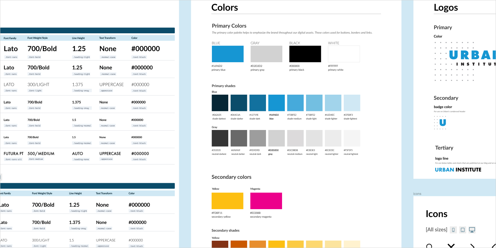
Implementing detailed design standards has been a significant advancement for our website and brand. By establishing a shared language, we’ve achieved a cohesive site design while also enabling rapid and precise creation of new layouts and features. As the product’s owner, I have spearheaded adoption of the system across the team, providing training and support to fellow designers and collaborating with them to seamlessly integrate the new standards into their daily workflows.
