Education data portal
DATA TOOL
Project overview
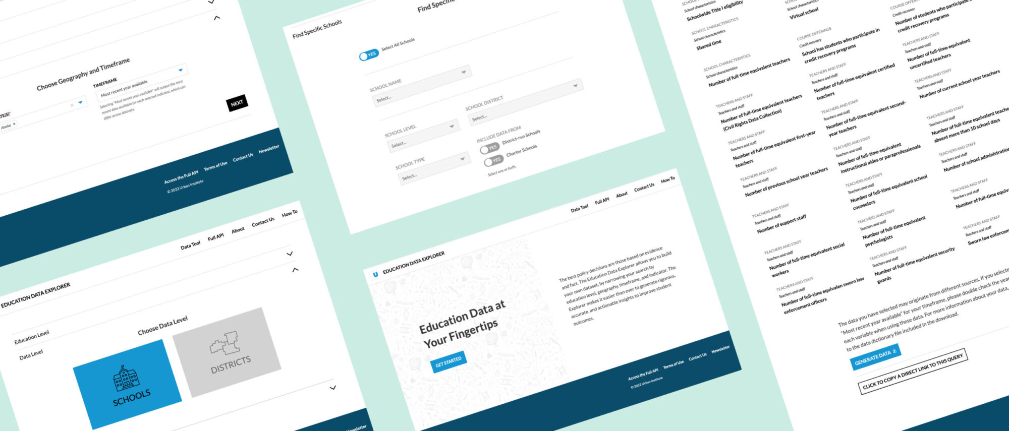
This tool pulls data from sources on education, harmonizing variables and documentation to make it easier to see trends and combine data. As part of the redesign I was brought in to rework the overall experience. I focused on improving the information architecture, the user flow and refining the UI elements on the portal.
Reducing friction
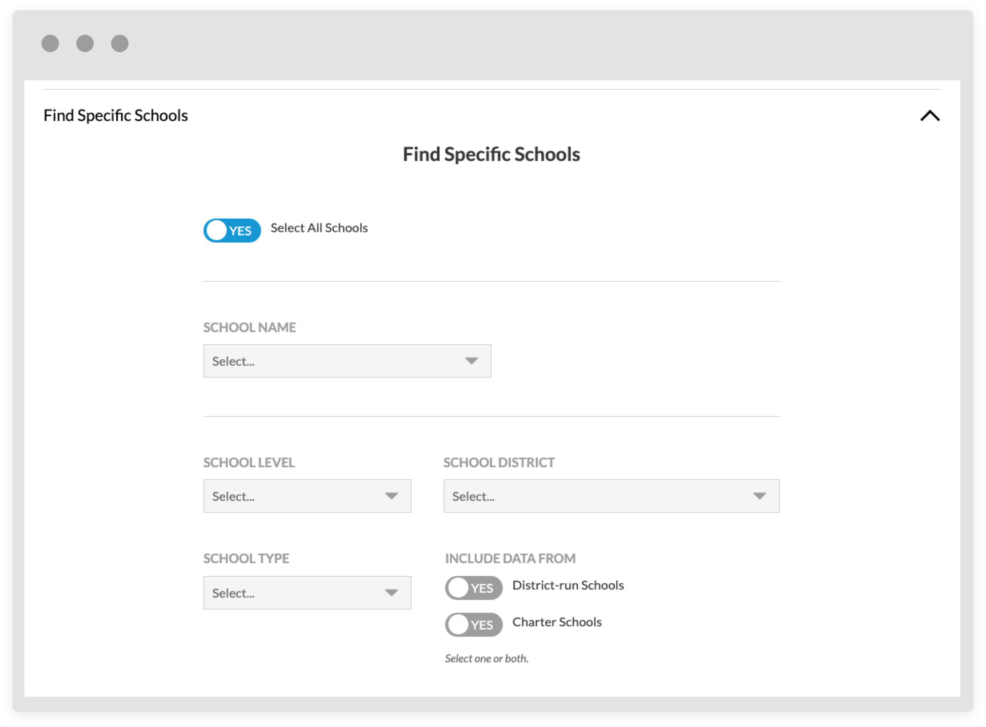
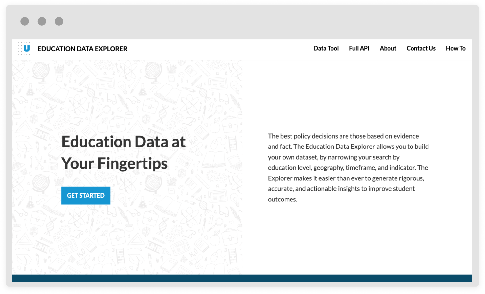
Wanting to refine the experience I looked at ways to reduce friction and improving clarity. Clear entry points into the tool from the homepage; providing more white space, increasing font sizes, and pulling inverted text to aid legibility. The amount of options and requirements was overwhelming, in the redesign I took a step-by-step approach so that a new or less advanced user had fewer choices to make at one time. Advanced users could navigate along a more complex to find many options and ways in which to parse the data.
Added functionality
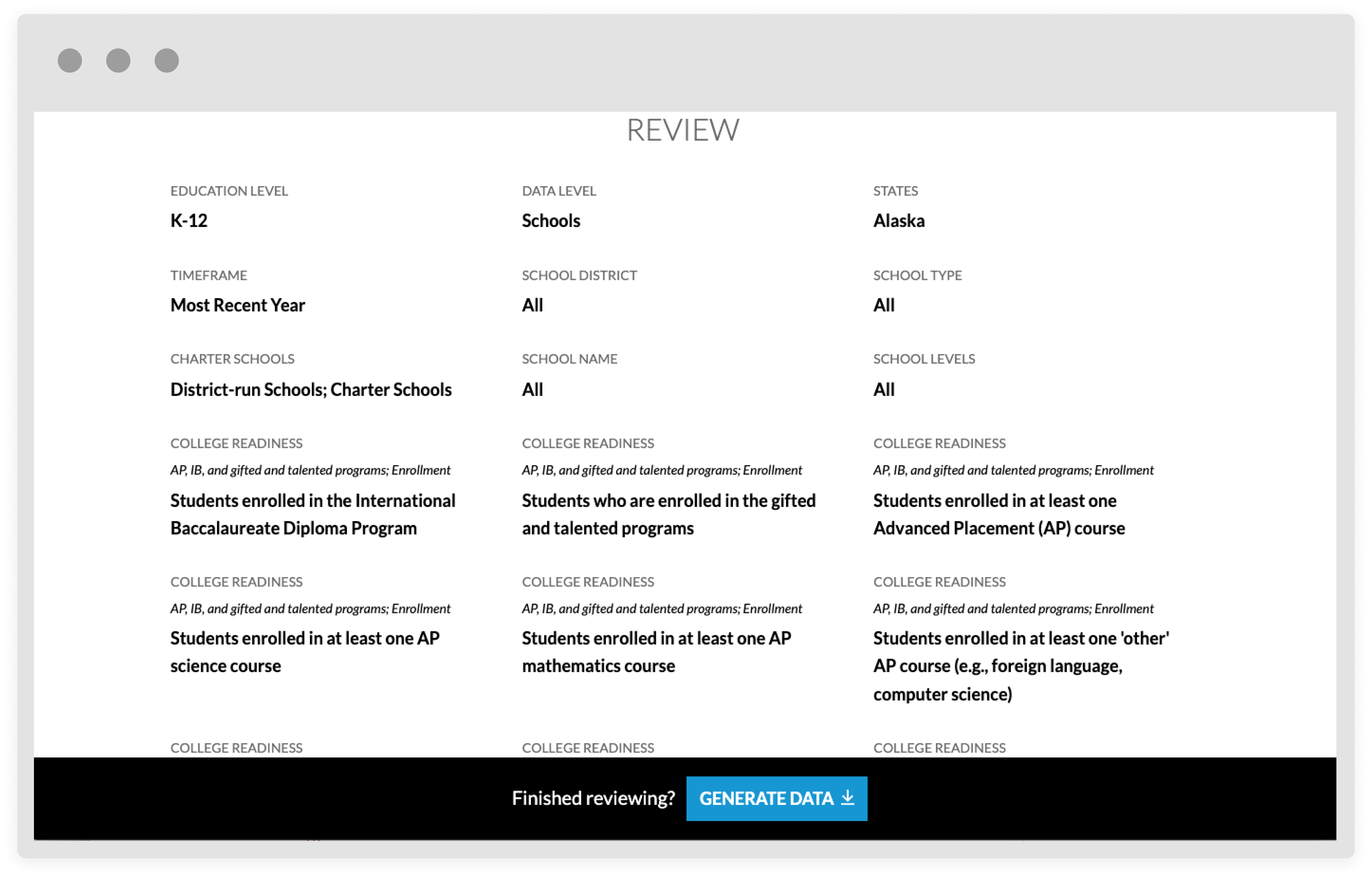
Beyond refining the structure already in place we rectified a few pain points and added new functionality. An example of this is the stand alone review page to pour over their choices before generating data with accompanying escape hatch if the user is ready to move on to the next step quickly.


