Nonprofit gains and losses
DATAVIZ DESIGN/ INTERACTIVE DESIGN
Project overview
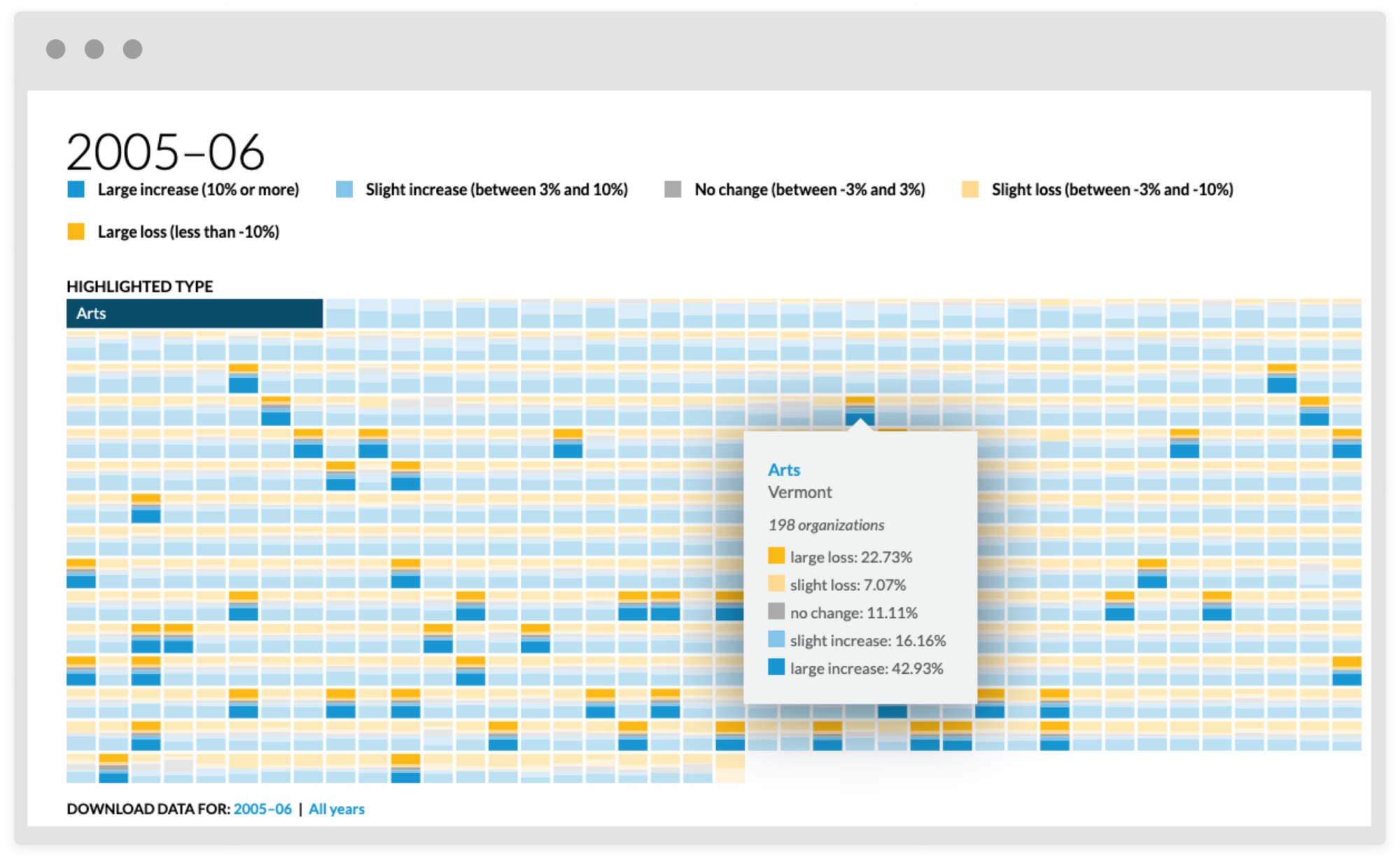
A data tool that showcase big picture trends in the nonprofit sector. The user can hone in on type of nonprofit, location and year or range of years. This exploratory project encourages the user to explore and dig to find what interests them.
Exploratory madlibs
We presented the reader from load with this madlibs style sentence that adjusts the view of what data is shown. Since this sentence is how to engage or change the tool they are front, center and unapologetically large.
Big picture
The dataviz is a mosaic of stacked bar charts. Each chart is a type of nonprofit in a single state and meant to illustrate the trends in that industry and in that state. Pulling back and viewing this as a whole you can see the big trends for across the county.


